
An award-winning agency whose brand did not match its methodology.
The Smarketers are a B2B marketing agency with a sharp, full-funnel methodology and real results. Their brand did not say any of that out loud. They asked me to close the gap between their strategic firepower and the generic first impression their identity was giving off.
Growth, aligned.
Mission. Deliver full-funnel marketing strategies that drive measurable growth and align sales and marketing for B2B enterprises worldwide.
Vision. Become the most trusted, result-oriented B2B marketing partner, helping businesses scale sustainably with insight-driven marketing.

An entire category drowning in blue.
The category audit made the opportunity obvious. B2B marketing agencies almost universally default to cold blue palettes and techy, sans-serif wordmarks. A sea of sameness.
A parallel audit of the old Smarketers brand surfaced four structural flaws:
- Generic logo with no proprietary idea.
- Typography that lacked clarity at small sizes.
- Color that did not scale across mediums.
- No system holding it all together.
Design the alignment right into the mark.
The strategic idea to lead with was alignment: sales and marketing fused into one force. The sketching work explored clever connections inside letterforms and abstract marks that could imply growth without showing a literal arrow pointing up.

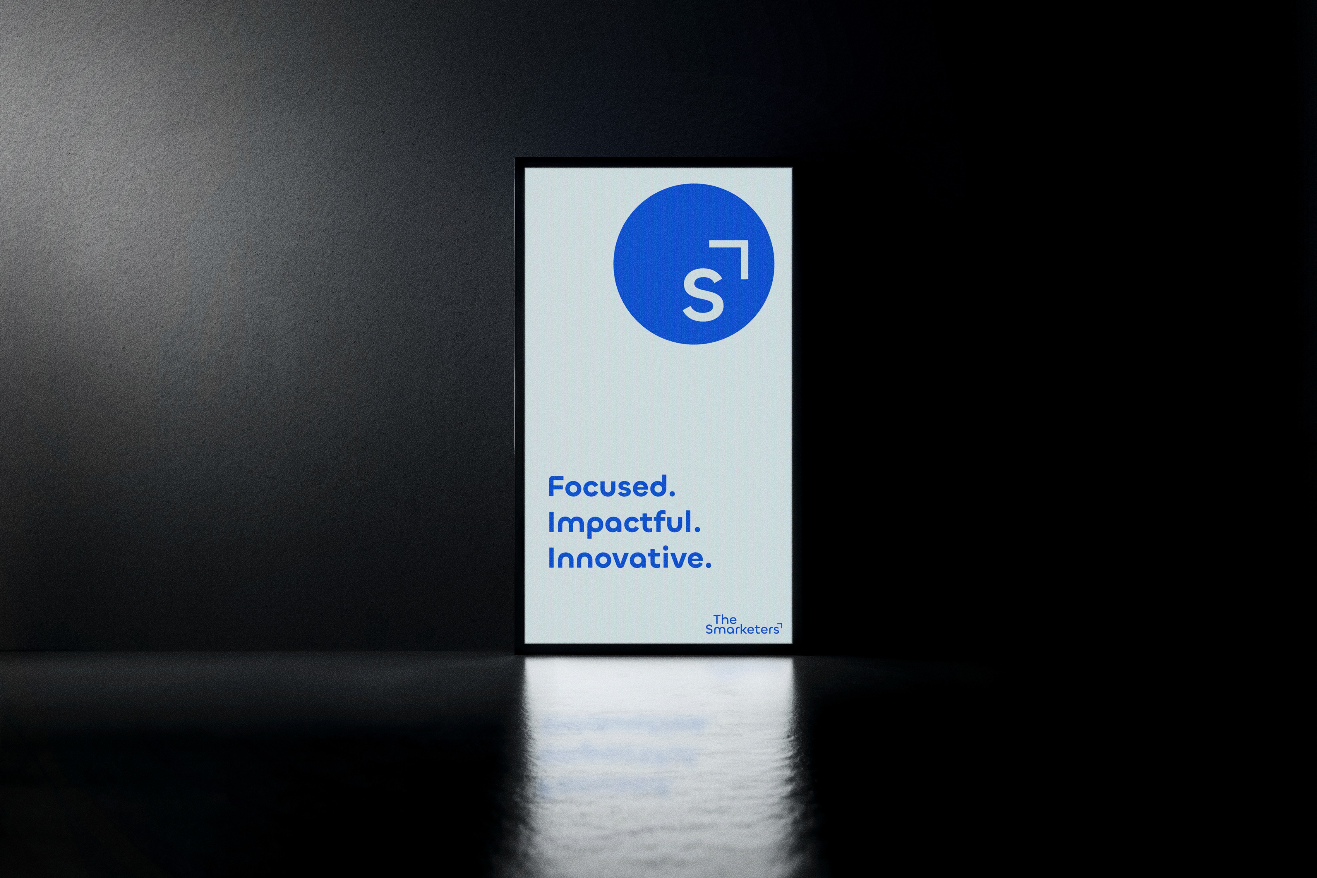
A circle, an S, and the growth arrow it was hiding all along.
The final brandmark is a solid circle representing the full-funnel approach. Inside, the S nods to the name. Extending from the S is a subtle upward arrow, the quiet payoff: growth, positive ROI, outcomes that compound. The wordmark pairs with a rounded geometric sans that balances professionalism with warmth.


Out of the sea of blue, into a brand that looks as smart as the work.
The rebrand gave The Smarketers a proprietary mark, a cohesive system, and a visible personality in a category that mostly blends together. The brand finally matches the methodology.